

6-Page Website Redesign
Overview
Inorganic.in is a furniture store that makes handcrafted, design-driven furniture. Their products are sold pan-India via their website.
About Inorganic.in
Home-owners | Working professionals | Business owners | Aged 40-60 years
Target Clientele
Creating a positive shopping experience to increase customer satisfaction and loyalty, thereby helping stakeholders achieve their business goals.
Redesign Goal
Process Overview
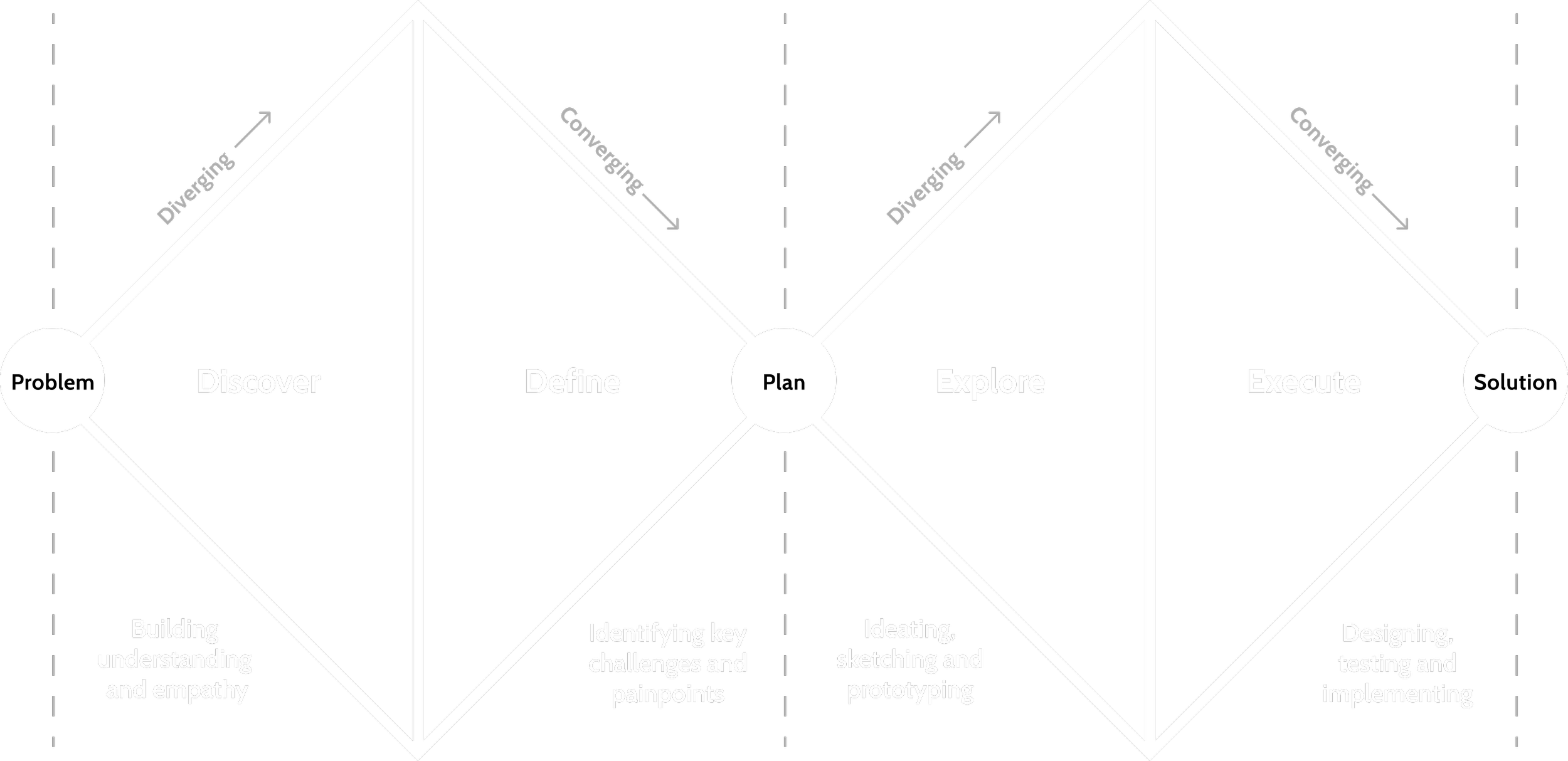

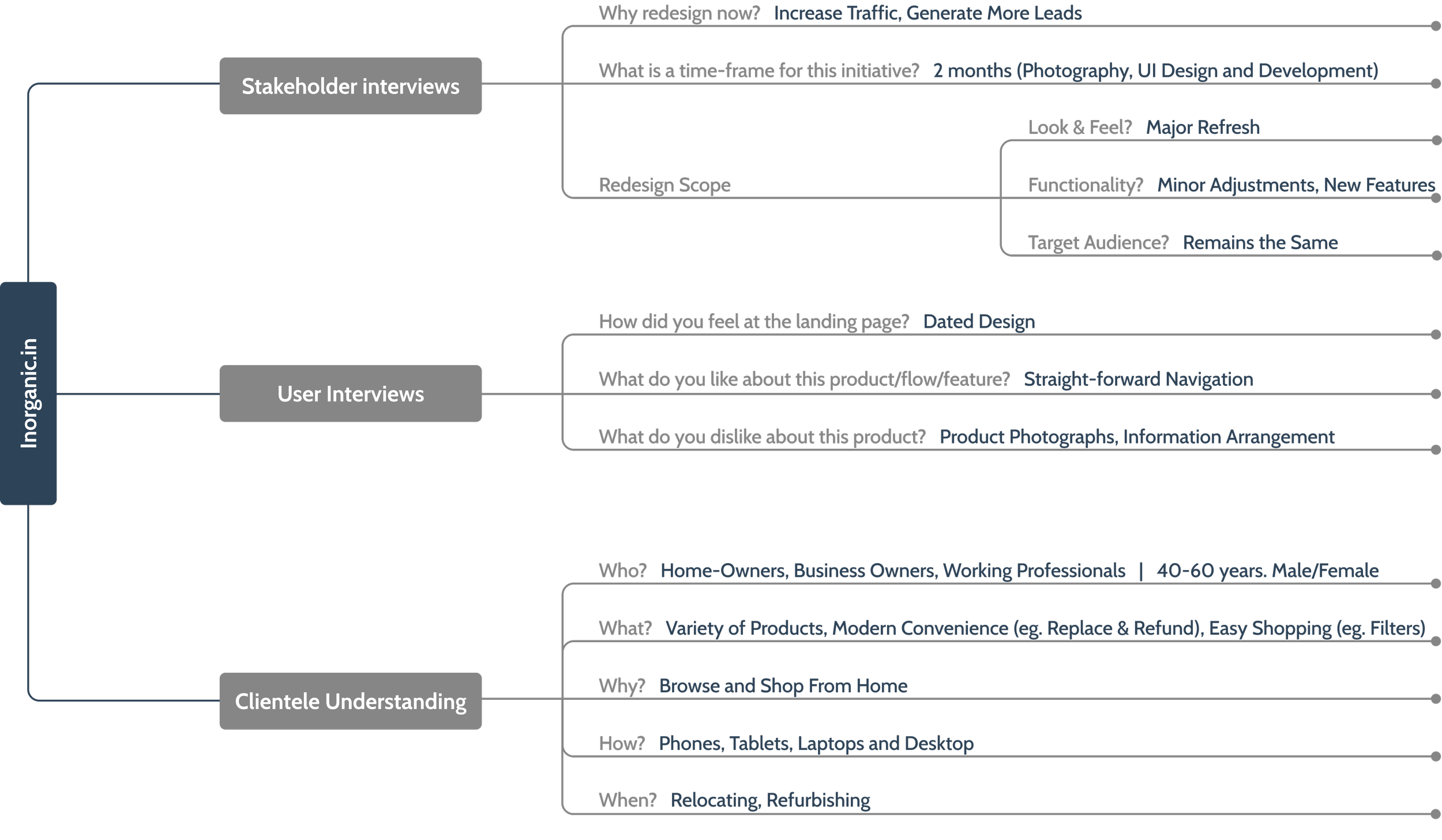
To bring everyone on the same page and unite over one common goal. I interviewed stakeholders and potential users to check their expectations, captured their insights, thoughts and suggestions to define jobs to be done.
Building shared understanding

Since this was a redesign, I had the luxury of learning from analytics and checking the real design performance without subjective judgments.
Tracking visitors’ entry and exit from different pages and what browser and screen size they are using helped me understand how users behave and their common journeys.
(Analytics data sharing restricted)
Reviewing analytics

Identifying key problem areas
(scroll horizontally to view more)


Problem Discovery:
Users need intuitive navigation and well organized information to quickly locate the desired products and their details.
Stakeholders aim to enhance website traffic, leading to increased sales.

Since this was a redesign, I had the luxury of learning from the existing personas, user journeys and value proposition. Hence, the next thing that I did was listing jobs-to-be-done to understand the user’s motivations and expectations.
Defining jobs to be done


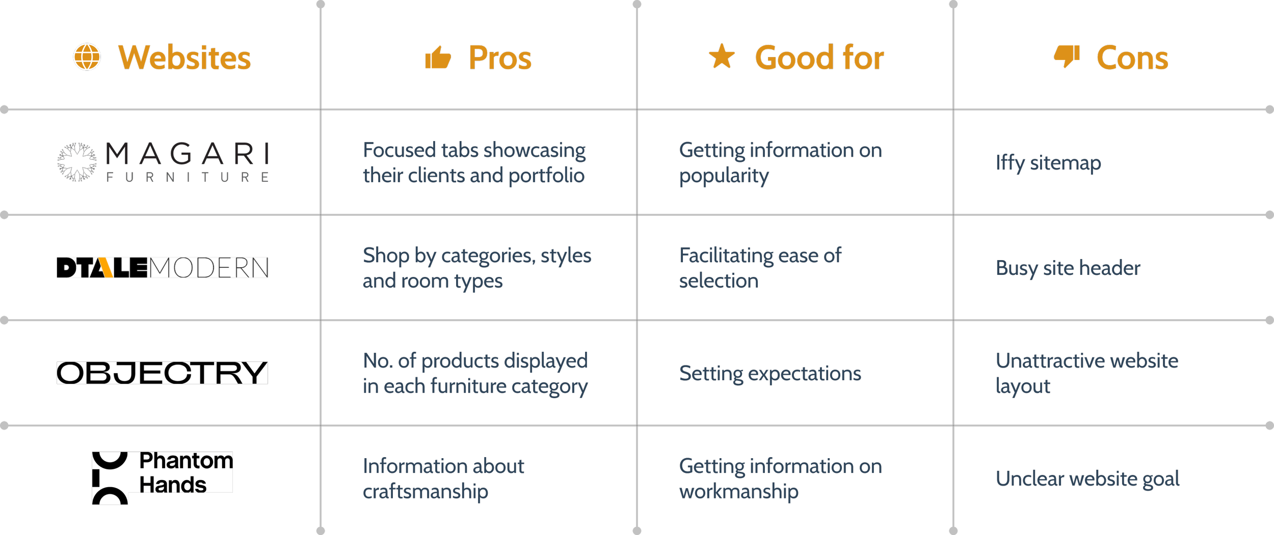
Comparing the existing website to its competitors gave us a high-level overview of where we stand.
Competitive analysis
ytytytytytytyt
ytytytytytyty
For each opportunity, I sat down with the stakeholders to map out the effort needed to deliver them and the amount of value we will add for the end-users. Ideally, we wanted to focus on the upper half in the graph below.
Value vs Effort

Identifying improvement opportunities:
Enabling users to shop by different categories helps them browse products in a structured way based on their preferences.
Providing social proof validates the quality and value proposition of the products, reducing uncertainty and hesitation.

Before diving into wire-framing, I ideated on site mapping to improve website navigation and restructured the three major sections of the website’s architecture - Home, Shop and About Us
Sitemap Redesign

Sitemap
Sitemap
Sitemap
Sitemap


Visual Language


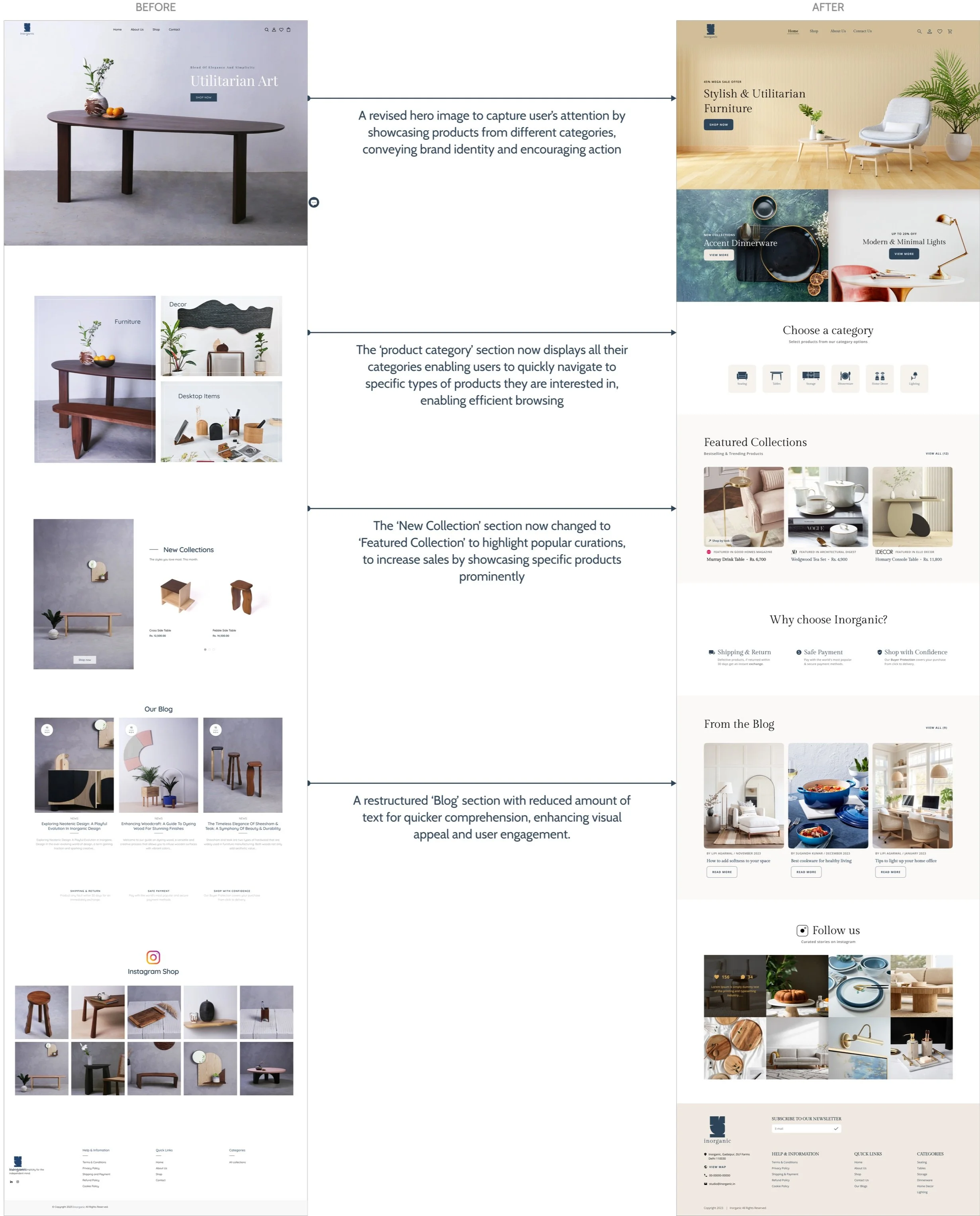
Restructuring the Homepage
More Mockups
(scroll horizontally to view more)


Link to the final prototype
Reflections
What I leant from this project?
Ease of navigation is key for online shopping. When users easily find what they want, be it products or categories, it makes their shopping experience much better. Clear menus, easy search, and well-organized products help users browse smoothly, leading to happier customers and more sales.
What would have I done differently?
I only designed the product side. With more time, it would have beeen worthwhile designing the check-out and AR flow.
More Projects
-
![Artclass]()
Case Study
ArtClass: A social marketplace app to share and learn exciting craft techniques nearby, or virtually.
-
![British Petroleum]()
5-day Sprint
British Petroleum ChargeHub: A route planning feature for electric vehicle owners.
-
![Accenture]()
Design Rationale
Musik: A lyric mode feature for its users to read and see lyrics while listening to the song.


